

Salesforce has built many read-to-use components in LWC/Aura frameworks like datatable, input etc. But, we don't find some ready-to-use components like lookup, modal which we often use in our custom component development. This post is to cover one of such components and not available as standard lwc component, i.e., lookup.
This is a simple and reusable lookup component which can be used on any lightning web/aura components and even on visualforce pages.
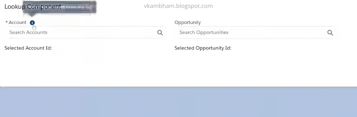
Now, let's reuse the above lookup component as many times as we want. In the below lookupHolder lwc component, I have added it two times, one works as Account lookup and another works as Opportunity lookup.
Click here to install this lookup component to your developer org.
Credits: Thanks to salesforce for bringing lwc open source project. This component is created with references from combobox.
PS: Thanks for checking this, hope this helps! Please share your feedback/suggestions.

This is a simple and reusable lookup component which can be used on any lightning web/aura components and even on visualforce pages.
lookup.html
<template>
<div class={formElementClass}>
<div if:false={isLabelHidden}>
<label class="slds-form-element__label" for="combobox-input">
<template if:true={_required}>
<abbr class="slds-required vk-cs-required" title="required">🞲</abbr>
</template>
{label}
</label>
<lightning-helptext if:true={showHelpText} content={_helpText}></lightning-helptext>
</div>
<div class="slds-form-element__control">
<div class={cbContainerClassClass}>
<div class={cbComputedClass} aria-expanded={isAriaExpanded} aria-haspopup="listbox" role="combobox" onclick={handleTriggerClick}>
<div class={cfeComputedClass} role="none">
<span if:true={isOptionSelected}>
<span if:true={hasIcon} class={entityIcon.class} title={entityIcon.title}>
<svg class={entityIcon.iconClass} aria-hidden="true">
<use xlink:href={entityIcon.url}></use>
</svg>
<span class="slds-assistive-text">{entityIcon.title}</span>
</span>
</span>
<input id="combobox-input"
type="text"
role="textbox"
value={selectedOption.label}
readonly={_readOnly}
required={_required}
placeholder={_placeHolder}
autocomplete="off"
aria-controls="listbox-id"
class={inputClass}
onkeyup={handleKeyUp}
onfocus={handleFocus}
onblur={handleBlur} />
<div class="slds-input__icon-group slds-input__icon-group_right">
<span if:false={isOptionSelected} class="slds-icon_container slds-icon-utility-search slds-input__icon slds-input__icon_right" title="Search">
<svg class={searchIconClass} aria-hidden="true">
<use xlink:href="/_slds/icons/utility-sprite/svg/symbols.svg#search"></use>
</svg>
<span class="slds-assistive-text">Search</span>
</span>
<button if:true={isOptionSelected} class="slds-button slds-button_icon slds-input__icon slds-input__icon_right" title="Remove selected option" onclick={removeSelectedOption}>
<svg class={closeIconClass} aria-hidden="true">
<use xlink:href="/_slds/icons/utility-sprite/svg/symbols.svg#close"></use>
</svg>
<span class="slds-assistive-text">Remove selected option</span>
</button>
</div>
</div>
<div id="listbox-id" role="listbox" class="slds-dropdown slds-dropdown_length-5 slds-dropdown_fluid" style="margin-top: 0;"
onmousedown={handleDropdownMouseDown} onmouseup={handleDropdownMouseUp} onmouseleave={handleDropdownMouseLeave}>
<ul class="slds-listbox slds-listbox_vertical" role="presentation">
<template for:each={optionsToDisplay} for:item="option">
<li role="presentation" class={option.outerClass} key={option.index} id={option.index} onclick={handleSelection}>
<div class={option.innerClass} role="option">
<span if:true={hasIcon} class="slds-media__figure slds-listbox__option-icon">
<span class="slds-icon_container">
<lightning-icon icon-name={iconName} size={_iconSize} class="slds-icon-text-default"></lightning-icon>
</span>
</span>
<span class="slds-media__body">
<span class="slds-listbox__option-text slds-listbox__option-text_entity">
{option.label}
</span>
</span>
</div>
</li>
</template>
<li if:true={noResultsFound} class="slds-p-left_small">☹ No results found</li>
</ul>
</div>
</div>
</div>
<div if:true={showMessage} role="alert" class="slds-form-element__help slds-is-absolute">{errorMessage}</div>
</div>
</div>
</template>
lookup.js
import { LightningElement, track, api } from 'lwc';

const formElement = 'slds-form-element';
const hasError = ' slds-has-error';
const cbContainerClass = 'slds-combobox_container';
const hasSelection = ' slds-has-selection';
const cbClass = 'slds-combobox slds-dropdown-trigger slds-dropdown-trigger_click';
const openMenu = ' slds-is-open';
const cbForm = 'slds-combobox__form-element slds-input-has-icon';
const hasIconRight = ' slds-input-has-icon_right';
const hasIconBothSides = ' slds-input-has-icon_left-right';
const optionOuterClass = 'slds-listbox__item';
const optionInnerClass = 'slds-media slds-media_center slds-listbox__option slds-listbox__option_entity slds-listbox__option_has-meta';
const entityIconClass = 'slds-icon_container slds-combobox__input-entity-icon';
const inputClass = 'slds-input slds-combobox__input slds-combobox__input-value';
const initOption = {value:'',label:''};

export default class Lookup extends LightningElement {
    @api label;
    @api value;
    @api disabled;
    @api errorMessage = 'Complete this field';
    @api isTableElement = false;

    @track _iconName;
    @track _iconSize = 'x-small';
    @track _readOnly;
    @track _required;
    @track _placeHolder = 'Search & Select...';
    @track _variant = 'label-stacked'; //label-inline, label-hidden, and label-stacked
    @track _helpText;
    @track showHelpText = false;
    @track title;
    @track isLabelHidden = false;
    @track showMessage = false;
    @track isAriaExpanded = false;

    @track optionsToDisplay = [];
    @track selectedOption = {...initOption};
    @track alwaysOption = {...initOption};
    @track isOptionSelected = false;
    @track noResultsFound = false;

    @track formElementClass = formElement;
    @track cbContainerClassClass = cbContainerClass;
    @track cbComputedClass = cbClass;
    @track cfeComputedClass = cbForm+hasIconRight;
    @track entityIcon = {};
    @track searchIconClass;
    @track closeIconClass;

    _formElement = formElement;
    _cbContainerClass = cbContainerClass;
    _inputHasFocus = false;
    _cancelBlur = false;
    _options = [];

    @api set options(value){
        if(!value) return;
        let i=0;
        value.forEach(opt => {
            let obj = {...opt};
            obj.index = i++;
            if(this.value && this.value === obj.value){
                this.selectedOption = {...obj};
            }else if(obj.isDefault){
                this.selectedOption = {...obj};
            }else if(obj.showAlways){
                this.alwaysOption = obj;
            }
            obj.outerClass = optionOuterClass;
            obj.innerClass = optionInnerClass;
            this.optionsToDisplay.push(obj);
            this._options.push(obj);
        });
	}
	get options(){
		return this._options;
    }

    @api set iconName(value){
        this._iconName = value ? value : '';
        this.hasIcon = value ? true : false;
        let iconType = value.split(':')[0];
        let iconName = value.split(':')[1]
        this.entityIcon.title = iconName;
        this.entityIcon.class = entityIconClass+' slds-icon-'+iconType+'-'+iconName;
        this.entityIcon.url = '/_slds/icons/'+iconType+'-sprite/svg/symbols.svg#'+iconName;
    }
    get iconName(){
        return this._iconName;
    }

    @api set iconSize(value){
        this._iconSize = value ? value : 'x-small';
    }
    get iconSize(){
        return this._iconSize;
    }

    @api set required(value){
        this._required = value ? value : false;
    }
    get required(){
        return this._required;
    }

    @api set readOnly(value){
        this._readOnly = value ? value : false;
    }
    get readOnly(){
        return this._readOnly;
    }

    @api set placeHolder(value){
        this._placeHolder = value ? value : this._placeHolder;
    }
    get placeHolder(){
        return this._placeHolder;
    }

    @api set variant(value){ //label-inline, label-hidden, and label-stacked
        this._variant = value ? value : 'label-stacked';
        this.isLabelHidden = value === 'label-hidden';
        this._formElement = value === 'label-inline' ? formElement+' slds-form-element_horizontal' : formElement+' slds-form-element_stacked';
        this.formElementClass = this._formElement;
    }
    get variant(){
        return this._variant;
    }

    @api set helpText(value){
        this._helpText = value;
        this.showHelpText = value ? true : false;
    }
    get helpText(){
        return this._helpText;
    }

    get inputElement() {
        return this.template.querySelector('input');
    }

    @api
    focus(){
        if(this._connected){
            this.inputElement.focus();
        }
    }

    @api
    blur() {
        if(this._connected) {
            this.inputElement.blur();
        }
    }

    //Called after the component finishes inserting to DOM
    connectedCallback() {
        this._connected = true;
        this.hasIcon = this.iconName ? true : false;
        if(this.isTableElement) this.isLabelHidden = true;
        this._cbContainerClass += ' '+this._iconSize;
        this.cbContainerClassClass = this._cbContainerClass;
        this.entityIcon.iconClass = 'slds-icon slds-icon_'+this._iconSize;
        this.searchIconClass = 'slds-icon slds-icon-text-default slds-icon_'+this._iconSize;
        this.closeIconClass = 'slds-button__icon slds-icon_'+this._iconSize;
        this.inputClass = inputClass+' '+this._iconSize;
        if(this.value) this.showSelectedOption(this.selectedOption);
    }

    disconnectedCallback() {
        this._connected = false;
    }

    handleTriggerClick(event) {
        event.stopPropagation();
        this._cancelBlur = false;

        if(!this.isOptionSelected && !this._readOnly && !this.disabled && !this.noResultsFound){
            this.openOptionsMenu();
            this.inputElement.focus();
        }
    }

    openOptionsMenu(){
        if(this._options.length > 0)
            this.optionsToDisplay = [...this._options];

        this.isAriaExpanded = true;
        this.cbComputedClass = cbClass+openMenu;
    }

    handleFocus() {
        //this.openOptionsMenu();
        this._inputHasFocus = true;
        this.dispatchEvent(new CustomEvent('focus'));
    }

	handleBlur() {
        if(this._cancelBlur) return;
        this._inputHasFocus = false;
        this.closeOptionsMenu();

        if(this.required && !this.selectedOption.value){
            this.formElementClass += hasError;
            if(!this.isTableElement){
                this.showMessage = true;
                this.errorMessage = 'Complete this field';
            }
        }
        this.dispatchEvent(new CustomEvent('blur'));
    }

    closeOptionsMenu(){
        this.isAriaExpanded = false;
        this.cbComputedClass = cbClass;
    }

    handleKeyUp(event) {
        if(event.target.readOnly) return;

        this.showMessage = false;
        this.noResultsFound = false;
        let searchKey = event.target.value;

        if(searchKey){
            this.selectedOption.label = searchKey;
            if(this.cbComputedClass !== cbClass+openMenu)
                this.cbComputedClass = cbClass+openMenu; //To show the options dropdown

            //Set the options to be displayed with search results
            searchKey = searchKey.toLowerCase();
            this.optionsToDisplay = this._options.filter(opt=>opt.label.toLowerCase().includes(searchKey));

            if(this.alwaysOption.value != '')
                this.optionsToDisplay.push(this.alwaysOption);
            else if(this.optionsToDisplay.length === 0)
                this.noResultsFound = true;
        }else{
            //this.closeOptionsMenu();
            this.selectedOption = {...initOption};
            this.optionsToDisplay = this._options;
        }
    }

    //DROPDOWN EVENTS
	handleDropdownMouseDown(event){
        const mainButton = 0;
        if(event.button === mainButton){
            this._cancelBlur = true;
        }
    }
	handleDropdownMouseUp() {
        this._cancelBlur = false;
    }

    handleSelection(event){
        event.stopPropagation(); //To stop event propagation up to a parent element

        this._cancelBlur = true;
        let obj = {...initOption};

        let childElm = event.target;
        let parentElm = childElm.parentNode;
        while(parentElm.tagName != 'LI') parentElm = parentElm.parentNode;
        let index = parentElm.id.split('-')[0]; //It will be in the format of option id-some number

        if(Number(index) < this._options.length)
            obj = this._options[index]; //Get the selected option details based on the id value of the object

        //Send to parent component only when selected option has a value
        if(!obj.value) return;
        this.showSelectedOption(obj);

        this.dispatchEvent(new CustomEvent('change', {detail: this.selectedOption})); //Dispatch change event
    }

    showSelectedOption(obj){
        this.selectedOption.value = obj.value;
        this.selectedOption.label = obj.label;
        this.isOptionSelected = true; //When it is true, it shows the option icon and close button
        this.formElementClass = this._formElement;
        this.cbContainerClassClass += hasSelection; //Add styles to the selected option
        this.cbComputedClass = cbClass; //To close the Options dropdown
        this.cfeComputedClass = cbForm;
        this.cfeComputedClass += this.hasIcon ? hasIconBothSides : hasIconRight; //Handles the option icon and close icon
        this._readOnly = true; //To avoid the input box editable
        this.showMessage = false;
    }

    removeSelectedOption(){
        this.selectedOption = {...initOption}; //Reset the selected option
        this.isOptionSelected = false; //To show search box
        this._readOnly = false; //Make search box editable
        this.cbContainerClassClass = this._cbContainerClass; //Reset the search box style
        this.cfeComputedClass = cbForm+hasIconRight; //To show the search icon only
        this.dispatchEvent(new CustomEvent('change', {detail: this.selectedOption})); //Dispatch change event
    }

}
lookup.css
.xx-small .slds-icon_container.slds-combobox__input-entity-icon {
    left: 0 !important;
    width: 1.1rem;
    height: 1.1rem;
}
.slds-combobox__input-entity-icon .slds-icon_xx-small{
    width: 1.1rem;
    height: 1.1rem;
}
[class*=slds-input-has-icon_left] .xx-small.slds-combobox__input.slds-combobox__input-value{
    padding-left: 1.5rem !important;
}
.slds-listbox_vertical .slds-listbox__option_has-meta .slds-media__figure{
    margin-top: 0;
}
.slds-combobox_container.slds-has-selection .slds-combobox__input-value,
.slds-combobox_container.slds-has-selection .slds-combobox__input-value:focus {
    box-shadow: none;
}
.cursor-not-allowed {
    cursor: not-allowed;
}
.pointer-not-allowed {
    pointer-events: none;
}
.slds-form-element_horizontal .slds-form-element__label{
    padding-top:.5rem;
}
.vk-cs-required{
    vertical-align: top;
    font-size: 8px;
}
Now, let's reuse the above lookup component as many times as we want. In the below lookupHolder lwc component, I have added it two times, one works as Account lookup and another works as Opportunity lookup.
lookupHolder.html
<template>
    <lightning-card title="Lookup Component">
        <lightning-layout vertical-align="center">
            <lightning-layout-item size="4" padding="around-small">
                <c-lookup if:true={showAccLookup} label="Account" options={accounts} required icon-name="standard:account"
                place-holder="Search Accounts" help-text="Select an account from the list" onchange={handleAccSelection}></c-lookup>
                <br/>Selected Account Id: {selectedAccId}
            </lightning-layout-item>
            <lightning-layout-item size="4" padding="around-small">
                <c-lookup if:true={showOppLookup} label="Opportunity" options={opps} icon-name="standard:opportunity"
                place-holder="Search Opportunities" onchange={handleOppSelection}></c-lookup>
                <br/>Selected Opportunity Id: {selectedOppId}
            </lightning-layout-item>
        </lightning-layout>
    </lightning-card>
</template>
lookupHolder.js
import { LightningElement, track, wire } from 'lwc';
import getAccounts from '@salesforce/apex/AccountController.getAccountList';
import getOpportunities from '@salesforce/apex/AccountController.getOpportunities';

export default class LookupHolder extends LightningElement {
    @track error;
    @track accounts = [];
    @track showAccLookup = false;
    @track opps = [];
    @track showOppLookup = false;
    @track selectedAccId;
    @track selectedOppId;

    @wire(getAccounts)
    wAccs({error,data}){
        if(data){
            for(let i=0; i<data.length; i++){
                let obj = {value: data[i].Id, label: data[i].Name};
                this.accounts.push(obj);
            }
            this.showAccLookup = true;
        }else{
            this.error = error;
        }
    }
    @wire(getOpportunities)
    wOpps({error,data}){
        if(data){
            for(let i=0; i<data.length; i++){
                let obj = {value: data[i].Id, label: data[i].Name};
                this.opps.push(obj);
            }
            this.showOppLookup = true;
        }else{
            this.error = error;
        }
    }

 //On Account lookup change
    handleAccSelection(event){
        let selectedOption = event.detail;
        this.selectedAccId = selectedOption.value;
    }


 //On Opportunity lookup change
    handleOppSelection(event){
        let selectedOption = event.detail;
        this.selectedOppId = selectedOption.value;
    }
}
Click here to install this lookup component to your developer org.
Credits: Thanks to salesforce for bringing lwc open source project. This component is created with references from combobox.
PS: Thanks for checking this, hope this helps! Please share your feedback/suggestions.
Neat code. So close to standard. thanks
ReplyDeleteThank you.
DeleteHi Venky,
ReplyDeleteThis is awesome. How can you prepopulate a Record from the lookupHolder? For example, I have an existing account that I want to have it prepopulated when the component launches, if the account is not there then I'd like to search for one. Is that possible?
Thanks in advance!
Hey Connan, thanks! Try to pass the id of the record for value attribute. Eg: . Please make sure the record id you are passing, should be in the options list.
DeleteHi Venky,
ReplyDeleteThanks a lot! for sharing these examples is very helpful.
Please upload class
ReplyDelete